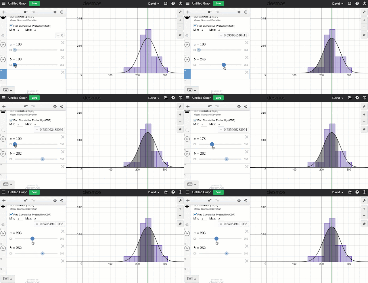
 So for years you have been able to two variable statistics really well. Finding the correlation and lines and curves of best fit is pretty easy and works really well. But this week Desmos released a long awaited update to include a whole suite of new single variable statistical tools including visualizations like dot plots, box plots and histograms. And of course the great thing about all of this stuff is that all of these visualizations can be made dynamic with a few Desmos slider tricks. For a really nice summary of some of the new features, check out the video from @bobloch below.
 But I wanted to point out a couple features that I really like. First of all the new Zoom Fit feature makes it easy to take any set of data and adjust the axes so that all the data can be seen. Basically all you do is create your graph and then click the icon that looks like the little magnifying glass with the plus in it. This icon will show up for any of the visualizations including the distributions.
  Another thing that I like is the control that you get with the various graphs. When you enter any of the functions you will be told what the arguments are for the function (like for histograms you have the data and you have the bin width) or you have arguments outside the function. For example, for box plot you can change the vertical position (Offset) of the box and it's vertical size (Height). But any of those values can be turned into dynamic values by creating sliders or the results of computations.
  Like all Desmos graphs you can save your work and this is probably the best way to get large data sets to students. And if you want to name your sets, you can get a bit more creative by using subscripts. To get to a subscript, start with a variable and then add a "1" and the subscript will appear. Then you can delete the 1 and add what ever you want in its place. Try it out with these data sets from previous posts: NFL Salaries or Concert Tours
That's a quick intro of the new features. Don't forget to check out the Desmos help files on visualizations, distributions and statistics for more info. Going forward, I will be including Desmos versions of the data sets I post so that you'll have your choice of software to use. Have fun.


Thanks for this amazing article on data I was Just searching for data in 2020 and Landed on this amazing website of yours.
ReplyDelete