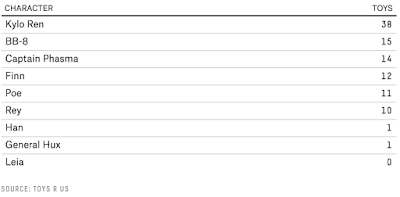
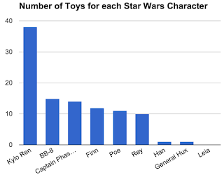
 This comes from a post from Five Thirty Eight looking at the distribution of new toys from the new Star Wars film. This is just a simple data set that could be made into a bar graph where students might be interested in the data. And it seems like maybe the scarcity of Rey toys was not accidental.
The Analysis
 There is not much analysis for students to do here. They can create the bar graph and then answer some questions about it. The point here is that the data set itself is what is interesting for students. Students could also make a pie graph from the data since it represents 100% of the data. One of the good things this data set can do is help show why pie graphs aren't that good for analysis since the data is so close to each other (if just looking at the pie slices it is hard to tell which is bigger - without the percents showing). Most statisticians agree that, for the most part, pie graphs are not very informative. Yet we see them all the time. For example, look at the two representations to the right. The bar graph and pie graph show the same information but the pie graph is only useful for specific analysis if the percentages are actually shown. Otherwise it would be hard to determine the relative sizes of the pieces of pie and thus the relative weights of each type of toy. The problem becomes even worse when you use a 3D pie graph (so often used on news shows) and without the percents you cannot tell the difference in size between many of the pies. Of course the pie graph looks nicer, though.
Sample Questions
- By what percentage do the number of Kylo Ren toys surpass BB-8?
- Which type of graph would be better for this data, bar or circle? Justify your choice.

Download the Data
Google Sheets (with graphs)The original post
http://fivethirtyeight.com/features/wheresrey-the-star-wars-heroine-is-featured-in-fewer-toys-than-all-the-new-dudes/

No comments:
Post a Comment