Sunday, February 24, 2019

Skipping World Record

A few months back I saw a 3Act Task called Rope Jumper that @gfletchy created out of this video:
He shows the first few seconds of the video and you have to guess how many skips are done in 30s. It's a good 3Act task. But that's not what we're doing here. Here I've actually collected the time data from each skip to do a bit of analysis (I had to slow the video down to 50% speed in order to get every skip).

Analysis

As you would guess it's pretty linear but you might notice, as you watch the video, that it seems like she might be slowing down at times. It's not super exciting in terms of the actual data but it could be used to simply help students in determining the least squared line.

Sample Questions

  • When was she skipping the fastest/slowest and what was the rate?
  • How many skips do you think she would make in 1 minute?
  • If she was to keep the pace that she had in the first few seconds, how many skips would she have made in 30s?
  • If she had skipped at the same rate as she did in her slowest section, would she still have broken the record.

Downloads

Let me know if you used this data set or if you have suggestions of what to do with it beyond this.

Thursday, February 7, 2019

New Desmos Statistics Package

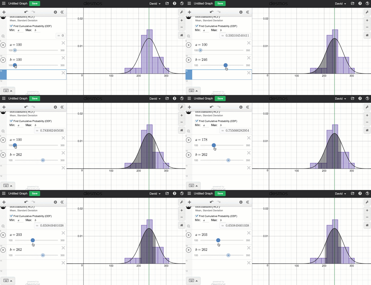
So for years you have been able to two variable statistics really well. Finding the correlation and lines and curves of best fit is pretty easy and works really well. But this week Desmos released a long awaited update to include a whole suite of new single variable statistical tools including visualizations like dot plots, box plots and histograms. And of course the great thing about all of this stuff is that all of these visualizations can be made dynamic with a few Desmos slider tricks. For a really nice summary of some of the new features, check out the video from @bobloch below.

But I wanted to point out a couple features that I really like. First of all the new Zoom Fit feature makes it easy to take any set of data and adjust the axes so that all the data can be seen. Basically all you do is create your graph and then click the icon that looks like the little magnifying glass with the plus in it. This icon will show up for any of the visualizations including the distributions. 
Another thing that I like is the control that you get with the various graphs. When you enter any of the functions you will be told what the arguments are for the function (like for histograms you have the data and you have the bin width) or you have arguments outside the function. For example, for box plot you can change the vertical position (Offset) of the box and it's vertical size (Height). But any of those values can be turned into dynamic values by creating sliders or the results of computations. 

Like all Desmos graphs you can save your work and this is probably the best way to get large data sets to students. And if you want to name your sets, you can get a bit more creative by using subscripts. To get to a subscript, start with a variable and then add a "1" and the subscript will appear. Then you can delete the 1 and add what ever you want in its place. Try it out with these data sets from previous posts: NFL Salaries or Concert Tours

That's a quick intro of the new features. Don't forget to check out the Desmos help files on visualizations, distributions and statistics for more info. Going forward, I will be including Desmos versions of the data sets I post so that you'll have your choice of software to use. Have fun.


Friday, January 4, 2019

Highest Grossing Concert Tours

Concerts are a multi billion dollar industry now. So why not use some concert data to do some statistical analysis. This data comes from the wikipedia page on the same subject. On the page the data is broken up into the top 20 all time highest grossing concerts (ordered by unadjusted by inflation numbers). Then it has the top grossing tours for each decade from the 80s until the present. There is data on the decade rank, gross and inflation adjusted gross, the number of shows attendance and other attributes.

Analysis

You can start with some categorical analysis by just looking at the who made the list each year. This data runs for four decades so kids might not be into who was big in the 80s but if you highlight the biggest acts of the last decade you can still see that more than half of them were artists that were around in the 80s (with U2 being #1) and U2, Guns n Roses and The Rolling Stones (twice) were in the top 5 of all time (inflation adjusted).

For more numerical analysis you could pick any of the data sets to do some single variable analysis. Whether it be central tendency, distributions, or histograms. There are many choices.

When you create some box plots you will find that some of the data sets have outliers. In particular, I think it's interesting that the outliers when dealing with the money are different from the outliers when dealing with the number of shows. This might lead you to explore things like the the Average Gross and compare it to the money and number of shows.

This might lead you to do some double variable analysis. Though there aren't any strong relationships, you could use this to maybe talk about relationships with poor correlations. Technically there is one strong relationship. That's the one between the Gross and the Inflation adjusted gross. This would be expected as one relates directly to the other. One thing that I like about this, however, is that it's not a perfect relationship. That is, who ever adjusted for inflation did so using different rates for each year (to make it more realistic, presumably).

Sample Questions


  • Which Artist made the most (over all/ or per concert)?
  • Which decade made the most money (adjusted for inflation)?
  • Which artists are outliers the most often?
  • Calculate the mean and median for each of the numeric attributes. How do these values suggest something about the distributions?

Downloads


Let me know if you used this data set or if you have suggestions of what to do with it beyond this.

Saturday, November 10, 2018

Notre Dame University - "The Shirt"

Guest Post - by Michael Lieff (@virgonomic)


Every year for the last 15 years, my neighbour, who is a die hard Fighting Irish fan, has planned a driving trip to Notre Dame University near South Bend, Indiana. I attended for the first time in 2017 and again in 2018. After a travel day, the first stop on the campus tour is the bookstore. In the lobby, they have a table with one style of short- and long-sleeve t-shirts. In 2017 "the shirt" was navy and it didn't really grab me.


However, in 2018 the shirt was kelly green which drew me in, as green is my favourite colour. I read the price tag and learned that "the shirt" is a student initiative and the proceeds go back into student activities and assistance. At $18 USD it was a no-brainer.

Once I had my shirt, I visited the URL on the price tag. There is a link to a timeline that shows the shirt design from every year, and more importantly, the number of shirts sold, the team's record and the shirt manufacturer. Found data! Even more interesting is that there is no data for number sold for the years 1994-1996.

Analysis

The first question that came to my mind is: how many shirts did they sell from 1994-1996? Due to this gap, the dataset is a really nice example to explore interpolation and extrapolation. I figured the trend would be linear and the line of best fit would give a pretty logical prediction. Upon visualization, it definitely isn't cut-and-dried.

There are some interesting things going on here.The number of shirts sold dropped fairly significantly from 1993 to 1997. It also skyrocketed in 2002 and then plummeted in 2004. Possible reasons for this would make for an interesting discussion.

Drilling a bit deeper, the next question that came to mind is: Are more shirts sold in seasons where the team is winning?

It doesn't appear so, but I will let you 'do the math'.

Sample Questions

In terms of analysis, the following questions could be asked:
  • Is the trend linear or is a curve a better model?
  • Can you interpolate the number of shirts sold in 1994-1996 where there is missing data? Extrapolate the number sold in 2018 or beyond?
  • What are the mean, median and mode number sold?
  • Do the number of shirts sold correlate with the team’s wins that season?

Download the Data

 Let us know if you use this dataset or have any suggestions for things to do with it beyond this.

Monday, November 5, 2018

2018 NFL Salaries

We have a local NFL player that went to high school in one of the schools I support. Luke Willson was recently on the Seattle Seahawks and currently is on our local Detroit Lions. In conversation, a coworker wondered how much his salary was. The Internet provides. Not only his salary, but the salary of every one of the almost 1800 players (who knew there were so many?).

And when you have such a large data set, I think that you should analyze it. It's not a particularly deep topic. But it's a good data set to talk about mean, median, skewing and outliers. Not anything super interesting from a data perspective but the context may be interesting enough to capture the interest of some of your students to do basic single variable analysis. The data includes info about a player's name, salary, position, team, overall rank and I added the team rank. There are 32 teams and a bit over 50 players per team.

Analysis


Certainly some things you can do are to create some graphs. The first types that comes to mind is a dot plot, box plot and histogram. In this case the dot and box plot are provided by CODAP while the histogram comes from Google Sheets. You can see from the dot plot that the mean and median are quite separated (which we would expect from the skewing) and that there are a large number of outliers.

Since we were talking about Luke Willson, we could certainly ask how his salary compares to other NFL players (he's 455th) or other players on his team (he's 18th of 56) or even how he compares to other people the same position (21st of about 126 tight ends and is above the mean tight end salary)

Sample Questions

  • Determine the mean, median and standard deviation for the salaries attribute.
  • Which team has the highest mean salary? median salary?
  • Choose a player of your choice, how do they compare to the league, team and position?
  • Besides the way it looks, what confirms that this data is skewed to the right?
  • Which team has the highest number of outliers?

Download the Data

Let me know if you used this data set or if you have suggestions of what to do with it beyond this.

Friday, October 26, 2018

Walnut Crushing World Record (with 3 Act Task)

Check out this video (thanks to @ddmeyer for pointing this one out).

So the guy crushes walnuts with his head and what we get is a linear relationship. There are a few things here. First off, there is a 3 Act task. I modelled the 3 Act task off of @Gfletchy's similar task for rope jumping. Secondly, I timed how long it took for each walnut to get crushed and collected in file (if you are interested, I slowed the video down by 50% then used an online timer to get the splits). So now you can do some analysis. It's not a particularly interesting data set but it might give a fun context to look at linear relationships.

3 Act Task

Act 1 - Watch the movie
How many walnuts will he be able to crush with his head in 60 seconds? Estimate
Write an estimate you know is too high.  Write an estimate you know is too low.

Act 2a - Before you show this ask students what information they would like to have.

Act 2b - Show this video for information with more accessible math

Act 2c - Show this video for information with even more accessible math

Act 3 - Show this video to reveal the answer.

Analysis

I guess the question that most comes to my mind (after "does he have a headache") is he crushing the walnuts at a constant rate. Careful observation might find a couple of spots where he hesitates a bit and you might want to discuss whether that shows up in the data. But is the data linear? Looking at the graph you can see that for the most part it is, but there is a slightly faster rate at the beginning and a slightly slower at the end but each section seems pretty linear.

Another thing you might want to discuss is whether it should be Time vs Walnuts or Walnuts vs Time. Since rates are usually per unit time then it probably makes sense to do Walnuts vs Time but you could argue that the total time depends on the number of walnuts or that the total number of walnuts you could crush depends on how much time you have. Note that the easiest way to swap the axes in a Google spreadsheet is by changing the position of the columns so to do that I just copied the Time column to both sides of the Walnuts column.

Sample Questions

Besides the above questions you could certainly ask:
  • What's the line of best fit?
  • What's the correlation?
  • How many walnuts do you think he could crush if it were two minutes? 10 minutes?
  • Is there a better fit than linear?
  • How many nuts would he have cracked if he kept at the same pace as the first 10 seconds?
  • If you only saw the first 5 seconds, what would be your prediction of the number crushed in 1 minute?
  • Can you tell, on the graph, when he hesitated?
  • What if he would have had the pace he finished with throughout the whole minute, how many nuts would he have cracked then? I think this was the previous record of 281

Download the Data

Let me know if you used this data set or if you have suggestions of what to do with it beyond this.

Sunday, August 26, 2018

Using the CODAP Online Statistics Software for Simple Analysis

So for years I have been a user of Fathom. Fathom is a dynamic statistical software package that has been available for teachers and students, free, here in Ontario. However, the software itself has not been updated over time and currently won't even run on a relatively recently purchased Mac. Not to fear, some of the creators of Fathom have come together to create the Common Online Data Analysis Platform (CODAP).

And because it was created by the people who gave us Fathom, it has a lot of similarities in style and function. It's not quite exactly the same but the biggest advantage is that it resides online so you can assign data for students to analyze and they can do so on any platform (probably not on a small screen phone very easily but still technically possible).
But for simple analysis, it does almost all the same things that Fathom did. Categorical and numerical analysis, mean & median, dot plots, scatter plots, linear regression, moveable lines, sum of squares, box plot, outliers and more. Some things it doesn't do (yet) are make bar graphs (though it makes the equivalent with dot plots) and histograms (though this may become an added feature). You can watch how easy it is to do some of those things dealing with simple analysis on the video seen below. If you want to play along with the video, here is the file that I used.

Once you know how to use the app, getting the data to your students is the next step. My preference is to have a pre-made CODAP file available for upload to CODAP. You can upload a file directly from any computer or conversely from a Google Drive. My preference is to do so from a Google drive. I have taken the liberty of converting many of the data sets on this blog to CODAP files. I have tagged all of them with the CODAP label here (also seen on the right side of the blog) or I have collected all the CODAP files in this folder. Conversely you can upload your own data in a .csv file. Though it does not seem like you can do this directly from a Google Drive. So I would stick to creating the CODAP files and sharing that with your students (either on Google drive or a local network drive). Either way, if you use any of these files, I would download them from this blog and then upload them to your preferred place.

And being redundant, here is a list of the past posts that I have done the conversion for and future posts will also have CODAP versions included.
Anscombe's Quartet
Smoking and Cancer
Movie Data
How Much Would you Pay for a $50 Gift Card?
Earthquake Data
Trending Data
Magazines
Speed Data
Electric Car Rebates
Is Levelling Up in Pokemon Go Exponential
Collecting Data from Pokemon Go

Don't forget to look at the CODAP site for lots of great resources. From more data sets, tutorials, FAQs and even though we haven't talked about them here, simulations. Or just look at the Educator Resources page.

Download the Data

All the Posts
Folder of CODAP files