Tuesday, January 26, 2016

Magazines

A while back I started doing this activity with my students on the first day. For homework I would tell them to go home and find two magazines, get their prices the number of pages and count the number of pages with ads on them. Once they brought that in then we would combine all the data into one set. I got the idea from browsing through an Oprah magazine and being shocked at how many pages I had to turn in order to get to a page that had actual content on it. Eventually I automated the process by using a Google Form to collect the data. And by adding another criteria (the type of magazine), this actually turns into a pretty rich data set.

The Analysis

Certainly with this data set you can do any number of things pertaining to calculations (average, standard deviation, correlation etc) but I liked to use it to start to have a need to move from single variable analysis to two variable analysis. For example, the magazine in the current set with the highest number of ad pages is In Style with 380 add pages (which is definitely an outlier)
This seems outrageous and the hope is that this will intrigue the students into asking questions. And perhaps they will also realize that it's the magazine with the largest number of total pages. And that then presents a need to do a different type of analysis (two variable scatter plot). And when you do that analysis you will see that although 380 pages is proportionally a little high for a magazine with 620 total pages and is not so outrageous.
This is a good data set to just look at the basic stuff (creating bar graphs, histograms, box plots, scatterplots, measuring central tendency, determining correlations, finding least squared lines etc)
Other things you can do is look at the break up popularity of magazine (in your class or with this data set) by type of magazine. By breaking it up into types of magazine, you can have an opportunity for students to compare graphs . When students compare graphs, an important skill to have them demonstrate is to make sure the size and scales of the graph are similar. This data set can help facilitate that.

Sample Questions

  • Create histograms of each of the numerical attributes and plot the mean and median on each graph. Describe each histogram as skewed right, left or symmetrical and justify your answers
  • Compare the graphs of total pages to ad pages
  • What proportion of magazines would be Sports & Entertainment in the average household?
  • What type of distribution would the number of ad pages be described as? Justify your answer.
  • Are there any outliers in the number of ad pages? Do the outliers change if you consider the type of magazine instead of the whole group?
  • Is the number of total pages (or ad pages) in the magazine correlated with the price of the magazine?
  • If a magazine were to have 120 pages, how many of them would you expect to have ads? Is this number different if you consider the type of magazine instead of all the magazines in the group?

Download the Data


Let me know if you used this data set or if you have suggestions of what to do with it beyond this.

Saturday, January 23, 2016

Trending Data

I have known about all of these trending search engines and thought they were quaint but recently I have actually seen some examples of uses that make me believe they maybe worth more and worth talking about in an senior Data Management class. For example I saw this one from @NateSilver538
Another example is from the Science Friday Podcast talking about tracking "hate" through Google searches. Listen below:
The trending site used in both of those cases was Google Trends and has been around for a while. Basically you put in the search terms you wish to compare and it shows how often they were searched on Google. For example the Superbowl is coming up in a couple of weeks so if you search "Superbowl", it shouldn't be surprising that we get a periodic pattern:


Once you have one search term, you can add others. For example, let's see how popular Christmas is compared to the Superbowl:

Another place to look for trending terms is Twitter. And the site Hashtags.org gives analytics. Here you enter a hashtag and get the last 24 hours of Twitter traffic for that hashtag (at least in the free version). You can't do a comparison of hashtags but you can search any hashtag you wish. However you could highlight

Another place you can get trend data is Quantcast.com. This site does analytics on website traffic in general
 
You can get detailed analytics for free from any of the sites that are listed as directly measured.

The Analysis

Though with most of the trending sites, there is not much analysis to be done, we often hear about topics "trending" so these sites can be used to bring something concrete to class. But some simple analysis can be done with the Quantcast site by just importing the table of sites and you can do work on histograms and even bar graphs.

Sample Questions 

  • Find a trending topic on Twitter or Google. Verify the data using one of the trending analytic sites. Compare to a similar topic.
  • How does the traffic of the top 10 most popular sites compare to the next 10?
  • Are there any outliers in the set of most popular sites?

Download the Data

Website: https://www.google.ca/trends/
Website: https://www.hashtags.org/
Website: https://www.quantcast.com/top-sites
Quantcast data (Sheets, Sheets with graphs, Fathom, Fathom with Graphs, CODAP)

Let me know if you used this data set or if you have suggestions of what to do with it beyond this.

Friday, January 15, 2016

Where are the Rey Star Wars Toys?

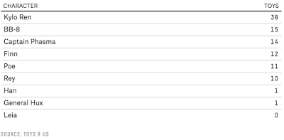
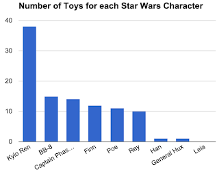
This comes from a post from Five Thirty Eight looking at the distribution of new toys from the new Star Wars film. This is just a simple data set that could be made into a bar graph where students might be interested in the data. And it seems like maybe the scarcity of Rey toys was not accidental.

The Analysis


There is not much analysis for students to do here. They can create the bar graph and then answer some questions about it. The point here is that the data set itself is what is interesting for students. Students could also make a pie graph from the data since it represents 100% of the data. One of the good things this data set can do is help show why pie graphs aren't that good for analysis since the data is so close to each other (if just looking at the pie slices it is hard to tell which is bigger - without the percents showing). Most statisticians agree that, for the most part, pie graphs are not very informative. Yet we see them all the time. For example, look at the two representations to the right. The bar graph and pie graph show the same information but the pie graph is only useful for specific analysis if the percentages are actually shown. Otherwise it would be hard to determine the relative sizes of the pieces of pie and thus the relative weights of each type of toy. The problem becomes even worse when you use a 3D pie graph (so often used on news shows) and without the percents you cannot tell the difference in size between many of the pies. Of course the pie graph looks nicer, though.

Sample Questions

  • By what percentage do the number of Kylo Ren toys surpass BB-8?
  • Which type of graph would be better for this data, bar or circle? Justify your choice.

Download the Data

Google Sheets (with graphs)
The original post
http://fivethirtyeight.com/features/wheresrey-the-star-wars-heroine-is-featured-in-fewer-toys-than-all-the-new-dudes/

Wednesday, January 6, 2016

Earthquake Database

Last week friends of mine felt a 4.8 magnitude earthquake on Vancouver Island. So it seems like a perfect time to post some resources on data about earthquakes. As it turns out, depending on the magnitude, there are a lot of earthquakes that happen world wide each year. And we can get that data, almost realtime, from any number of earthquake databases. I like the one that the US Geological Service provides. This lets you set a few options and search earthquakes based on those options. The default is then a map that shows the result of your search.

The Analysis

Once you chose which options to use, then you have to get the data. I suggest that you limit your searches originally to those over magnitude 6 if you are looking at an extended time period (in 2015 there were over 140. If you play around with the magnitude (say dropping the threshold to 4.5) then you could get a huge amount (which you may or may not want). For example, if you drop that threshold to 4.5 there are over 6800 earthquakes found from 2015.

Once you get the data, you can just click the Download button on the top left to choose a CSV file that can be imported into any spreadsheet or Fathom. The obvious analysis here is a single variable set of the Magnitude (they call it mag in the data set). So you could do any number of histograms, box plots, dot plots etc as well as measures of central tendency and standard deviation. It's a really good data set for having students go through all the basic calculations needed when doing a single variable analysis.

Depending on when you get your data you will get outliers.

Usually the data will come out skewed to the right as most of the quakes are typically at the low end (this is regardless of what you choose as your threshold.
You can also do a neat "heat map" by choosing Map in CODAP and dragging something like the Magnitude onto the middle of the graph so it appears as a colour spectrum. This can be done in Fathom by plotting the Longitude and Latitude (and thus getting a map) onto the regular graph.


Here's a quick video on getting this data from the database into CODAP to use the Mapping feature:


Sample Questions

  • Determine the measures of central tendency for the magnitude of the earthquakes
  • Determine the five number summary for the magnitude of the earthquakes
  • Which earthquake(s) were the most extreme? Where they outliers?
  • How are the measures of central tendency affected if you remove the outlier(s) when looking at the magnitude of the earthquakes?
  • Determine whether the data for the magnitude of the earthquakes is skewed to the right or left.

Other Earthquake Data

If students are trying to do something more with their earthquake data (like analyze then make sense of it) they might try getting more info at IRIS (Incorporated Research Institutions for Seismology). There they have some of the same data and more plus other info that might be relative. Thanks to @frankmcgowa for that one

Download the data

Let me know if you used this data set or if you have suggestions of what to do with it beyond this.