Saturday, September 17, 2016

Collecting Data from Pokemon Go

It's the beginning of the school year now and the dust is starting to settle from the summer's obsession with Pokemon Go. So why not try to leverage that obsession by having students collect some data. The data comes in the form of how many times each Pokemon was seen and caught by each user. I got the idea for this set of data from this post from @lesliefarooq where she pointed out that with each Pokemon caught, when you look in the Pokedex, there is data about how many times each Pokemon was both seen and caught. At first glance this is a simple data set but it turns out there is a lot you could do with it.

So what I was able to do was start to collect some of that data by using a Google Form to generate two types of graphs. The first was a graph of the most often seen Pokemon (no surprise to players what the top three were). The second graph was the linear relationship between the number of caught and the number seen. What follows are the ways that you can either use my data or collect your own with your students.

Analysis

So the first thing you need to do is get the data. Once in the game, tap on the Pokeball at the bottom of the screen, then the Pokedex and then tap on any Pokemon that shows up. Once you get to the Pokemon screen you can collect the Pokemon number, the name is optional (to make entry into the form quicker, I only required the number), how many they saw, how many they caught and finally the type of Pokemon. Here you will get the data on each Pokemon. Swiping left or right will cycle between each Pokemon so you can collect the data faster. So if you have students that have been playing the game, they can collect the data there. You might want them to collect it manually or they can use this form to add to my data electronically or you can make a copy of this form to create your own class set.

Once you have the data, the first thing that you can have students do is create a bar graph of their most popular Pokemon like @lesliefarooq did. What I did is took that a step further. Since I collected the data via a Google form, I used a bit of spreadsheet wizardry to tally up the total number of Pokemon of each type seen given all the data. You can see that in my data sheet where I have added some columns to the right where the data is collected. The nice thing about this is that as more people add their data to my form, it will continue to update the totals. So with this data you can do some of the same thing that @lesliefarooq did and ask students about their most popular Pokemon and compare to the graphic that shows how popular or rare each Pokemon is.

But the nice thing about this data is that you can now use the connection between the sightings and catches to connect to linear relationships. It's not a perfectly linear relationship but it will have a very strong correlation.

NOTE: In the actual game, players will collect Pokemon in two ways. The main way is by having them appear and then catching them by throwing Pokeballs at them. Most Pokemon will be caught this way. The second way is to hatch eggs. And the only way to hatch an egg is to physically walk 2km, 5km or 10km (that is one of the physical activities that the game promotes). When you hatch an egg, they are often more rare Pokemon that you will never see "in the wild". So these will always be seen once and caught once. This means that if you do any linear regression, you will have a large number of data that will be (1, 1) and that will skew your regression making it stronger. So I suggest removing any of those data pieces. In the set that I give as a sample, I have already done that (see below).

So this data set will be good for introductory linear relations with interpolation and extrapolation but what I have also done is extract some of the data into smaller sets. Because when we collected the data we also asked about the Pokemon number and Pokemon type. So this means we can start to use that info. For example, we can break up the big set into smaller sets, each corresponding to a different Pokemon. To facilitate that, I have created both a Fathom file and a Desmos Activity with these smaller sets (try it out here). The Desmos file, as it is set up, would be good for beginners when it comes to interpolation and extrapolation but it could be augmented for further exploration of lines of best fit. The Fathom file would be good for comparison of lines of best fit for the data sets. In the original data set you can also do things comparing the types of Pokemon as well.

Sample Questions

  • How does your top 20 most popular Pokemon compare to the top 20 of the larger set?
  • How does the number of each type of Pokemon compare to each other?
  • Which Pokemon has the highest number of average catches?
  • Which Pokemon is easier to catch, based on the data?
  • How does the linearity of the data relate to how easy the Pokemon could be caught?
  • Which type of Pokemon is easier to catch? Which one has the largest correlation?

Download the Data

Let me know if you used this data set or if you have suggestions of what to do with it beyond this.

Wednesday, July 27, 2016

Is Levelling Up in Pokemon Go Exponential?

Unless you have been living under a rock over the last few weeks, you've probably heard of Pokemon Go. If you are not aware, the general premiss is that you wander your neighbourhood (physically) with the App open. The app is linked to GPS and Google maps so as you walk around you see your streets but overlying those streets are various Pokemon characters to capture and along the way you collect points by visiting PokeStops (to also collect items) and PokeGyms (to also have battles). Along the way you "Level Up" by accumulating experience (XP) points. As you increase your level, the number of points needed to go to the next level also increases. But how? Is it linear, quadratic, exponential or something else? Well, get the data and have your students decide.

Analysis

As far as anyone knows (right now) there are only 40 levels. To move past the 1st level you need to accumulate 1000 pts but by level 40 you need five million. So the question might be "How does the number of points change as you go from level to level?".

As players are in the game, they will level up. What they will see is the number of points needed to get to the next level (not the total number of points accumulated). The first 15 levels can be seen to the right. The middle column shows the total number of points at the beginning of each level (constructed from the points needed to level up for each level). The right most column indicates how many points are needed in each level to get to the next level (this is what players would actually see). It is essentially the 1st difference of the total points. But to clarify, players never see the Total number of XP in the game. It was just constructed here because that is usually what we would be graphing. So to keep your street cred with the kids, you may want to only refer to the XP needed at each level and construct the total (like I did) for mathematical purposes.

Regardless, this is one of the first places you can have students do some analysis. By looking at the points need to level up you can see that as you go from level to level, the number of points needed goes up 1000 pts per level until level 11 where it starts to stabilize for a few levels.

As you look at all the levels there are a couple of ways you can look at it. By plotting all 40 levels you can see that an exponential model is almost a perfect fit with a geometric progression of little more than 25% each time you level up, though not exactly. A different view could be by putting the levels in groups of 5. Doing this shows that as you go up levels you need significantly more XP points to get to the next group of levels.

But a closer look at the data shows that the first 11 levels have a constant 2nd difference and thus are quadratic. And then the next few levels have constant first differences and thus go up linearly. After that the increases are not as consistent. 

So there are many places in the curriculum that this data set can relate to. On the simple end you can look at it as a non linear data set. Or you can just focus on the first few levels and keep it quadratic or contrast that with the linear portion. The fact that we are talking about discrete levels means that you can think about this in terms of sequences and series. So take from it what you need. Below are some possible prompts you can use with students and the entire set can be downloaded from this Google Doc for easy consumption.

Sample Questions

  • If it took you one day to get to level 5, how long would it take you to get to level 10? Level 15? Level 40?
  • What type of relationship exists between the points for each level in the first 10 levels? 15 levels? all levels?
  • Do the levels follow a constant sequence?

Download the Data

Let me know if you used this data set or if you have suggestions of what to do with it beyond this.

Monday, June 6, 2016

Electric Car Rebates

So this article came across my Facebook feed a while back and I though it was a great potential source of data for discussion at many levels
It certainly captured my attention as an Ontario resident but a closer look showed that there was potentially a lot of data to be analyzed. The data is about the Ontario Electric Vehicle Incentive program and the above article was inspired by this news release but in the article they were able to get more specific data about number of vehicles of each style (which is not released).

Analysis

Students are encouraged to look critically at the original article and perhaps talk about how the title and some of the information given is used to incite a reaction.
For example even though they gave the overall numbers of almost 4800 people getting around $39 million in rebates, they focused on just the rebates of the most expensive cars which total about 2% of the people and rebate value. And although they do mention it, it's not highlighted but about 25% of those rebates went to one vehicle, the Chevrolet Volt.
But looking at the ministry website you can see a nice data set about which cars get which rebates (as well as info about how the program changed once it was pointed out that super expensive luxury cars were getting rebates.
I was able to get this table out and clean it up as well as add the approximate value of each car to the list (it's approximate because I had to go and search each out on the web so I might have been a bit lazy when it came to options) and now it is good for some simple analysis.
On the "low hanging fruit" end you can create the bar graph of the number of models for each company. Personally, I wouldn't have guessed GM to be at the top. But you can also create a histogram of the actual rebate to look at the distribution (or perhaps look at the box plot or dot plot). Lastly you could look at whether there is a connection with the price of the car and how big the rebate is.

Sample Questions

  • Which manufacturer has the most electric models?
  • What is the most common rebate value?
  • Does the rebate get bigger (in general) as the price of the car increases?
  • If you were going to purchase an electric vehicle, which one would benefit the most/least from the rebate program?

Download the Data

Let me know if you used this data set or if you have suggestions of what to do with it beyond this.

Tuesday, May 24, 2016

Gas Prices in Ontario

A friend, Michael Lieff pointed this nice set of data out. It is the price of gas in several Ontario cities going as far back as 1990. This is an interesting data set as the price of gas, in general, increases but you can see that that wasn't always the case (only a few of the cities are shown below).

Analysis

When you go to this website you have several options for prices and you can download a year of data at a time (with a CSV as an option). The obvious choice is regular gasoline but you might want to consider things like comparing regular gas to alternative fuels like propane. For example in this case, you can see that, in general, propane also has risen in price over time but where gasoline seems to fluctuate similarly regardless of the city, propane seems to be more volatile depending on location.

Because of the shear amount of data points possible (you can get a weekly average for the last 25 years for several cities if you want), you may wish to stick to yearly values. Another option is to use some of he weekly values to talk about the dangers of extrapolation


Download the Data

Site http://www.energy.gov.on.ca/en/fuel-prices/
I have also taken the liberty of downloading all of the data for gasoline (all 25 years of it) in weekly, monthly and yearly form. As well as the yearly propane data. You can get it on this Google sheet (note the tabs) or just the gas prices on Fathom

Let me know if you used this data set or if you have suggestions of what to do with it beyond this.

Friday, May 13, 2016

The Data and Story Library - DASL

DASL (pronounced "dazzle") is the Data and Story Library is an awesome database of sets of data that are specifically to help teach topics of statistics. They are all real sets and are all categorized by topic/subtject (eg automotive, food, health, sports etc) and mathematical method (eg boxplots, mean, outliers, regression, scatterplots etc). So theoretically if you wanted to find a set of data that could be used to help teach a specific topic you could search for, say, "correlation"
These are some great data sets to get through the mechanical nature of statistics. It's not very current data but it's great for practicing statistical methods.
For the longest time this set of data was not available but just recently it was hosted by Data Description Inc. so now we have access to it again.

Analysis

There are far too many sets to talk about analysis but when the site was down I blogged about one of my favourite sets on Smoking and Cancer. Take a look at that post to get a sense of the data. When you get to any data set, to see the actual data file, click on the Datafile Name

This will show you the text file of the data with the download link at the top of the page.
From that point you can do the analysis. Each data set will have a detailed description of each variable and a short story and sample analysis of each set
There are many data sets on this site for every statistical topic and on a range of subjects. One thing you might have your students do is just explore on this site and find data sets that can be used to exemplify a particular statistical concept.

Download the Data


Let me know if you used this data set or if you have suggestions of what to do with it beyond this.

Saturday, March 5, 2016

Speed Data

A few weeks ago I saw this Tweet
I used to have some data kicking around my computer but I did a quick Google search and found that Car & Driver was a huge source of this type of data. And I love that you can get some of the data with their original hand written data sheets. BTW, here is @MJFenton's finished activity
And the teacher version.

The Analysis

Let's start with the data set from the above post. You can certainly do Desmos Need for Speed activity. The analysis in terms of determining a function is a little intense (IE not a standard function model). You can see some of the more exact analysis via the two links in the tweet below.
But if you didn't want to go too deep you could just use it to talk about non linear relationships or you could use it to talk about rates of change as speed data comes up a lot in calculus.
I have also found more data sets from different cars and you can see how they compare to each other on this Desmos file.

Download the Data

There actually is a lot of data that can be found on the Car & Driver site. Many of the cars in this link have data sheets (you really have to search around on each page to find the data sheet). But I have downloaded a few of them (seen in the Desmos file above) and created a Google Sheet for each so you can copy and paste the data where ever you want.
Porsche Spyder Data Sheet Google Sheet
Dodge Challenger Data Sheet Google Sheet
Chevy Camaro Data Sheet Google Sheet
Cadalac CTS Data Sheet Google Sheet
Chevy Malibu Data Sheet Google Sheet
Honda Fit Data Sheet Google Sheet
All Google Sheets
All data in CODAP file (with graph)

Let me know if you used this data set or if you have suggestions of what to do with it beyond this.

Tuesday, January 26, 2016

Magazines

A while back I started doing this activity with my students on the first day. For homework I would tell them to go home and find two magazines, get their prices the number of pages and count the number of pages with ads on them. Once they brought that in then we would combine all the data into one set. I got the idea from browsing through an Oprah magazine and being shocked at how many pages I had to turn in order to get to a page that had actual content on it. Eventually I automated the process by using a Google Form to collect the data. And by adding another criteria (the type of magazine), this actually turns into a pretty rich data set.

The Analysis

Certainly with this data set you can do any number of things pertaining to calculations (average, standard deviation, correlation etc) but I liked to use it to start to have a need to move from single variable analysis to two variable analysis. For example, the magazine in the current set with the highest number of ad pages is In Style with 380 add pages (which is definitely an outlier)
This seems outrageous and the hope is that this will intrigue the students into asking questions. And perhaps they will also realize that it's the magazine with the largest number of total pages. And that then presents a need to do a different type of analysis (two variable scatter plot). And when you do that analysis you will see that although 380 pages is proportionally a little high for a magazine with 620 total pages and is not so outrageous.
This is a good data set to just look at the basic stuff (creating bar graphs, histograms, box plots, scatterplots, measuring central tendency, determining correlations, finding least squared lines etc)
Other things you can do is look at the break up popularity of magazine (in your class or with this data set) by type of magazine. By breaking it up into types of magazine, you can have an opportunity for students to compare graphs . When students compare graphs, an important skill to have them demonstrate is to make sure the size and scales of the graph are similar. This data set can help facilitate that.

Sample Questions

  • Create histograms of each of the numerical attributes and plot the mean and median on each graph. Describe each histogram as skewed right, left or symmetrical and justify your answers
  • Compare the graphs of total pages to ad pages
  • What proportion of magazines would be Sports & Entertainment in the average household?
  • What type of distribution would the number of ad pages be described as? Justify your answer.
  • Are there any outliers in the number of ad pages? Do the outliers change if you consider the type of magazine instead of the whole group?
  • Is the number of total pages (or ad pages) in the magazine correlated with the price of the magazine?
  • If a magazine were to have 120 pages, how many of them would you expect to have ads? Is this number different if you consider the type of magazine instead of all the magazines in the group?

Download the Data


Let me know if you used this data set or if you have suggestions of what to do with it beyond this.

Saturday, January 23, 2016

Trending Data

I have known about all of these trending search engines and thought they were quaint but recently I have actually seen some examples of uses that make me believe they maybe worth more and worth talking about in an senior Data Management class. For example I saw this one from @NateSilver538
Another example is from the Science Friday Podcast talking about tracking "hate" through Google searches. Listen below:
The trending site used in both of those cases was Google Trends and has been around for a while. Basically you put in the search terms you wish to compare and it shows how often they were searched on Google. For example the Superbowl is coming up in a couple of weeks so if you search "Superbowl", it shouldn't be surprising that we get a periodic pattern:


Once you have one search term, you can add others. For example, let's see how popular Christmas is compared to the Superbowl:

Another place to look for trending terms is Twitter. And the site Hashtags.org gives analytics. Here you enter a hashtag and get the last 24 hours of Twitter traffic for that hashtag (at least in the free version). You can't do a comparison of hashtags but you can search any hashtag you wish. However you could highlight

Another place you can get trend data is Quantcast.com. This site does analytics on website traffic in general
 
You can get detailed analytics for free from any of the sites that are listed as directly measured.

The Analysis

Though with most of the trending sites, there is not much analysis to be done, we often hear about topics "trending" so these sites can be used to bring something concrete to class. But some simple analysis can be done with the Quantcast site by just importing the table of sites and you can do work on histograms and even bar graphs.

Sample Questions 

  • Find a trending topic on Twitter or Google. Verify the data using one of the trending analytic sites. Compare to a similar topic.
  • How does the traffic of the top 10 most popular sites compare to the next 10?
  • Are there any outliers in the set of most popular sites?

Download the Data

Website: https://www.google.ca/trends/
Website: https://www.hashtags.org/
Website: https://www.quantcast.com/top-sites
Quantcast data (Sheets, Sheets with graphs, Fathom, Fathom with Graphs, CODAP)

Let me know if you used this data set or if you have suggestions of what to do with it beyond this.

Friday, January 15, 2016

Where are the Rey Star Wars Toys?

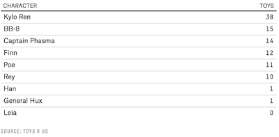
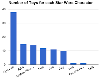
This comes from a post from Five Thirty Eight looking at the distribution of new toys from the new Star Wars film. This is just a simple data set that could be made into a bar graph where students might be interested in the data. And it seems like maybe the scarcity of Rey toys was not accidental.

The Analysis


There is not much analysis for students to do here. They can create the bar graph and then answer some questions about it. The point here is that the data set itself is what is interesting for students. Students could also make a pie graph from the data since it represents 100% of the data. One of the good things this data set can do is help show why pie graphs aren't that good for analysis since the data is so close to each other (if just looking at the pie slices it is hard to tell which is bigger - without the percents showing). Most statisticians agree that, for the most part, pie graphs are not very informative. Yet we see them all the time. For example, look at the two representations to the right. The bar graph and pie graph show the same information but the pie graph is only useful for specific analysis if the percentages are actually shown. Otherwise it would be hard to determine the relative sizes of the pieces of pie and thus the relative weights of each type of toy. The problem becomes even worse when you use a 3D pie graph (so often used on news shows) and without the percents you cannot tell the difference in size between many of the pies. Of course the pie graph looks nicer, though.

Sample Questions

  • By what percentage do the number of Kylo Ren toys surpass BB-8?
  • Which type of graph would be better for this data, bar or circle? Justify your choice.

Download the Data

Google Sheets (with graphs)
The original post
http://fivethirtyeight.com/features/wheresrey-the-star-wars-heroine-is-featured-in-fewer-toys-than-all-the-new-dudes/

Wednesday, January 6, 2016

Earthquake Database

Last week friends of mine felt a 4.8 magnitude earthquake on Vancouver Island. So it seems like a perfect time to post some resources on data about earthquakes. As it turns out, depending on the magnitude, there are a lot of earthquakes that happen world wide each year. And we can get that data, almost realtime, from any number of earthquake databases. I like the one that the US Geological Service provides. This lets you set a few options and search earthquakes based on those options. The default is then a map that shows the result of your search.

The Analysis

Once you chose which options to use, then you have to get the data. I suggest that you limit your searches originally to those over magnitude 6 if you are looking at an extended time period (in 2015 there were over 140. If you play around with the magnitude (say dropping the threshold to 4.5) then you could get a huge amount (which you may or may not want). For example, if you drop that threshold to 4.5 there are over 6800 earthquakes found from 2015.

Once you get the data, you can just click the Download button on the top left to choose a CSV file that can be imported into any spreadsheet or Fathom. The obvious analysis here is a single variable set of the Magnitude (they call it mag in the data set). So you could do any number of histograms, box plots, dot plots etc as well as measures of central tendency and standard deviation. It's a really good data set for having students go through all the basic calculations needed when doing a single variable analysis.

Depending on when you get your data you will get outliers.

Usually the data will come out skewed to the right as most of the quakes are typically at the low end (this is regardless of what you choose as your threshold.
You can also do a neat "heat map" by choosing Map in CODAP and dragging something like the Magnitude onto the middle of the graph so it appears as a colour spectrum. This can be done in Fathom by plotting the Longitude and Latitude (and thus getting a map) onto the regular graph.


Here's a quick video on getting this data from the database into CODAP to use the Mapping feature:


Sample Questions

  • Determine the measures of central tendency for the magnitude of the earthquakes
  • Determine the five number summary for the magnitude of the earthquakes
  • Which earthquake(s) were the most extreme? Where they outliers?
  • How are the measures of central tendency affected if you remove the outlier(s) when looking at the magnitude of the earthquakes?
  • Determine whether the data for the magnitude of the earthquakes is skewed to the right or left.

Other Earthquake Data

If students are trying to do something more with their earthquake data (like analyze then make sense of it) they might try getting more info at IRIS (Incorporated Research Institutions for Seismology). There they have some of the same data and more plus other info that might be relative. Thanks to @frankmcgowa for that one

Download the data

Let me know if you used this data set or if you have suggestions of what to do with it beyond this.